This post is about performance charts; it just so happens that I’m using one that just appeared on Twitter by Charles Schwab. As the saying goes, “credit where credit is due,” so I’m obligated to acknowledge my source. But, I’m not really wanting to critique Charles Schwab’s charts … it just that, well, I am (and at no cost to Charles Schwab, I might add).
Performance charts: what’s good?
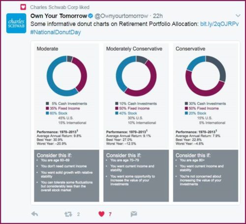
I want to begin by saying I love this post. It’s quite timely, given that it apparently appeared yesterday, which was “National Donut Day,” so tying in donut charts is quite clever (whoever came up with the idea deserves a reward!). Why others didn’t think of this, I can’t say (or, if they did, I didn’t notice or they didn’t flow my way).
The layout is attractive, crisp, and to the point. It combines color with graphics, along with some very good text. It compares three risk levels: moderate, moderately conservative, conservative. All quite good.
And, it provides some summary criteria for each.
All good stuff.
Oh, and was the choice of gray for the boxes with the criteria intentional? As a gray-haired sexagenarian, the color seems to fit!
Performance charts: what’s not so good?
We could have titled this post “the good, the bad, and the ugly,” after one of my favorite movies by the same name, but there’s really nothing ugly about the chart. But, there are somethings that I consider bad.
First, “Average Annual Return.” This term should be banned from all reporting. Do they mean “annualized”? If yes, then say it. But, if they actually did calculate average annual returns, they’re misleading statistics. Case in point:
- year one: +100%;
- year two: -50%.
Average annual return is therefore +25%. But, what really occurred here?
- Start with $1,000 it grows to $2,000 in year 1,
- and then drops to $1,000 in year 2.
And so, the actual return across the period is 0.00 percent.
Let’s avoid, banish, deride, outlaw even, average annual returns.
Second, where’s the risk? Shouldn’t some risk measure accompany these charts?
Of course, we also don’t know the source of the data (indexes? which ones?), and if the returns are net or gross of fees, net or gross of transaction costs.
Going beyond the performance charts posted: provide a link!
Okay, so in their defense, if you want to keep a chart as clean and crisp as you can (a bit of clever alliteration on my part that I felt obligated to point out), then you can’t put everything you’d like here.
But, it serves its purpose: it gets your attention.
Solution: provide a link to the other information, which it does:

Overall, a really nice chart, I’d say.